Best Uses
- Bacterial growth, radioactive decay, and other exponential lab data
- Bode plots and frequency response across several decades
- Power law relationships plotted as a straight line on log-log
- Any data set whose values span more than one order of magnitude
Print Setup
The default file is generated for LETTER paper in portrait
orientation. Print at actual size when spacing matters.
The linked PDF is a static file, so it can be downloaded, printed, and shared even if custom generation is unavailable.
Semi-log or log-log: which one you need
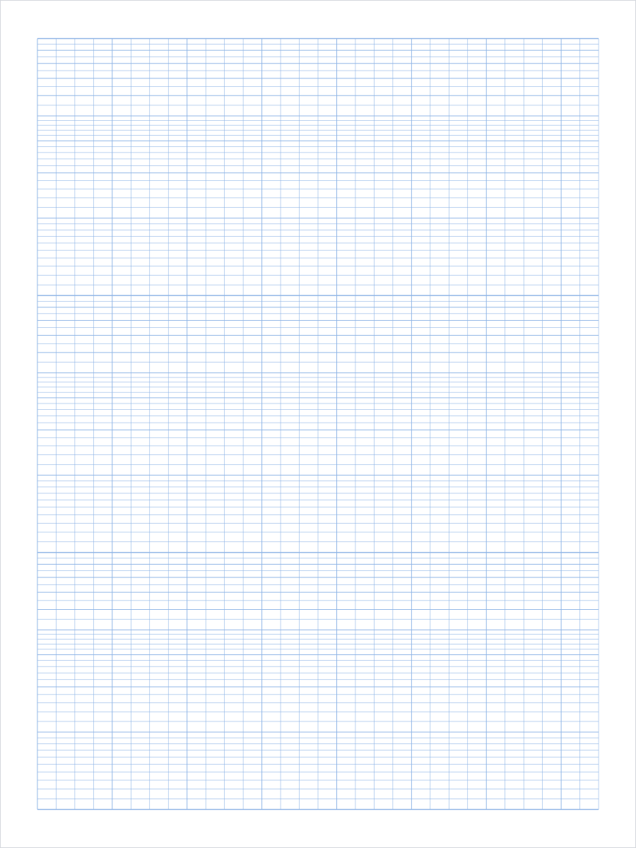
The two sheets answer different questions, and picking the wrong one is the usual reason a plot refuses to straighten out. Semi-log paper is logarithmic up the page and linear across it. Use it when something changes by a constant factor per unit of time or distance: a bacterial culture doubling every twenty minutes, a radioactive sample halving every half life, a capacitor discharging, a signal attenuating along a cable. Any relationship of the form y equals a times b to the power x plots as a straight line, and the slope of that line gives you the growth or decay rate directly.
Log-log paper is logarithmic on both axes. Use it when neither quantity is a clock and you suspect one is a power of the other: drag against velocity, flow rate against pipe diameter, metabolic rate against body mass, earthquake frequency against magnitude. Any relationship of the form y equals a times x to the power n plots as a straight line, and here the slope is the exponent n itself. That is why the default log-log sheet on this page has square decades.
A quick test if you are unsure which you have. Take three points spread across your data and check what happens between them. If y multiplies by a constant factor each time x adds a constant amount, you want semi-log. If y multiplies by a constant factor each time x multiplies by a constant factor, you want log-log. If neither holds, log paper will not straighten the plot and ordinary graph paper is the better sheet.
Reading a logarithmic scale
A logarithmic axis places a value at its logarithm rather than at the value itself, which is why the lines crowd together as you climb each decade. The line marked 2 sits 30.1 percent of the way up its cycle, because log 2 is 0.301. The line marked 5 sits at 69.9 percent. That leaves the gap between 1 and 2 nearly six times wider than the gap between 8 and 9, and it is the single most common thing to get wrong when drawing a log scale by hand: 2 does not go a fifth of the way up.
Because the pattern is set by the logarithm and not by where you start, every decade on the sheet is identical. The spacing from 1 to 2 is the same as the spacing from 10 to 20 and from 100 to 200. That also means the sheet carries no printed numbers: the same three cycles serve data running from 1 to 1000, from 0.001 to 1, or from 20 to 20000. You choose the starting power of ten and label the heavy lines yourself.
The subdivisions between the numbered lines change as you go up a decade, which is deliberate rather than an artefact. Between 1 and 2 the minor lines step by 0.1, between 2 and 5 they step by 0.2, and between 5 and 10 they step by 0.5. A uniform step of 0.1 all the way up would put the last few lines about a third of a millimetre apart and they would print as a solid bar, so the subdivision coarsens exactly where the scale compresses.
Choosing the number of cycles
Count the range your data spans, not the number of readings you have. The axis is conventionally started on a power of ten, so the rule is to round your smallest value down to a power of ten, round your largest value up to one, and count the steps between them. Readings from 2 to 900 run from 1 to 1000, which is three cycles. Readings from 5 to 4000 run from 1 to 10000, which is four, even though the ratio between them is only 800. There is no such thing as a partial cycle.
Do not take more cycles than the data needs. Every decade you add is another share of the page height, and the unused ones stay on the sheet whether you plot in them or not. Four cycles on Letter leaves each decade 2.5 inches tall and the tightest minor lines about a millimetre apart, which is near the limit of what an inkjet resolves cleanly. One cycle gives the same data a full ten inches of height and a scale you can read to three figures.
If your range only just spills over a boundary, it is often worth rescaling the data instead of buying another decade. Values from 8 to 1200 run from 1 to 10000 once they are rounded outward, so they need four cycles. Divide every reading by 8 and the range becomes 1 to 150, which fits in three. The plot is identical in shape; only the labels on the heavy lines change, and you divide the answer back out at the end.
Printing it at true scale
Print at actual size or 100 percent scale, never with fit to page or shrink oversized pages. Those options rescale the sheet by a few percent, which is invisible on a square grid but changes the height of a decade, and the height of a decade is the unit every reading on a log axis is measured against.
Check one sheet before printing a stack. On a semi-log sheet, measure the full height of one decade rather than a subdivision: on Letter with the default half inch margins, three cycles put each decade at 3.33 inches, or 85 mm. On the log-log sheet, measure a decade across and a decade up and confirm they match, since a square decade is what makes the slope readable as an exponent. Both come out at 2.5 inches, or 63.5 mm, on Letter.
The default sheet uses light blue lines, which stay visible under pencil while letting the plotted points sit on top. Switch the colour to gray or black before photocopying or scanning, because light blue often drops out of a copier entirely. If the crowded lines near the top of each decade look grey and merged on your printer, keep the light line weight and switch the colour rather than raising the weight, which closes those gaps up further.